Notice anything different?
In a recent post I mentioned that we’ve found ourselves on a path that we wouldn’t have predicted we’d be on just a few short years ago.
Although we’re not quite ready to quit our day jobs, the more we do here, the more produce we grow, the more fruit trees we graft and plant, the more chickens and turkeys we raise, the more hives, coops, and pens we build, and soon, the more goats we raise, the more we love what we do, and the more clear our path is before us.
When we started blogging what we’re doing here, we obviously needed a name, an identity. It made the most sense to name the farm though, not just the blog. After racking our brains for a few weeks trying to find a name that not only we felt a connection to, but that also had an available web domain, we finally settled on Curbstone Valley Farm.
For some time now we’ve been wanting to put together a more formal identity for the farm. Something simple, recognizable, but meaningful, primarily for our online branding, letterhead, honey labels, business cards, etc.
That said, our first attempt at an ‘identity’ of sorts was, well, hurried, and in my personal opinion, something of a flop.
What is a ‘Curbstone Valley’ anyway? It sounds nonsensical. In a half-hearted attempt, and somewhat at a loss, we ‘borrowed’ a triple spiral design from the carvings on the Newgrange kerbstones. I had no idea how to represent the farm’s name. It was never intended to be permanent, but at the time we had an orchard to plant, so it would have to do for the interim.
For those who don’t know, we have a very personal connection to the farm name, odd as the name may sound, as it’s a perfect anagram of our family names. When we finally succeed in moving to a new location, the farm name will follow us, no matter where we end up.
Those that follow our blog have a sense of who we are. Our friends know who we are. However, those that have never met us, in person, or virtually, have no idea who we are, or what we do, and our former logo did nothing to help convey that. That’s what identity, and branding, is all about. The adage that a picture is worth a thousand words, in regards to branding, is so true, but we found ourselves with something of an identity crisis. The farm name doesn’t lend itself well to an obvious image, so a few months ago we decided to hire some expert help.
Frustrated with my own lack of artistic ability, I asked a friend if she could help conceptualize, and represent, where we are today, and where we hope to be for many more years to come. We were fortunate in that she happens to do this sort of thing for a living, and has much more artistic talent than I do.
We began with some preliminary discussion to define what it is we do, or hope to do. At one point it almost seemed as if it would be easier to say what we don’t do, or plan to do! It quickly became clear that if we weren’t careful, between the native and heirloom gardens, bees, turkeys, goats, orchard, and poultry, that we couldn’t represent every aspect of what we do without the risk of the logo becoming muddled, overcrowded, and confused. We prioritized some elements over others, outlined some preferred color palettes, and left the rest to her imagination.
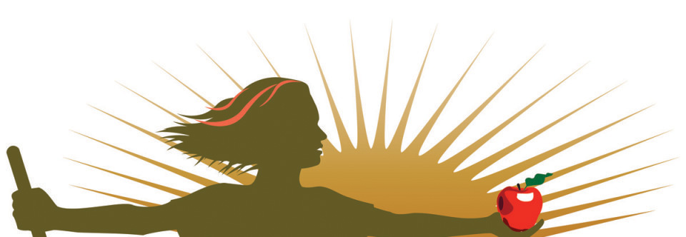
Soon thereafter we had the first round of illustrations presented to us, with various concepts for our perusal, and immediately a particular, unique, illustration struck a chord with me. After some brief discussion, our new Curbstone Valley Farm logo was born. Between us, for reference purposes, this logo was affectionately dubbed ‘Farm Woman’.
Despite being quite simple overall, this new logo conveys a tremendous amount of information about us, and about the Farm. That’s exactly what we were looking for.
We both gravitate toward early 20th Century Craftsman Period art and architecture, hence the use of a custom font in the style of that period. It’s similar to the font we’ve used previously, but now with a few changes it’s uniquely our own. In a perfect world, our ideal would be someday to find a farmhouse, with land attached, from the Craftsman period, with all of its original woodwork intact. I know, that’s a fairly tall order, especially around here, but we can dream, can’t we?
Over the last few years we’ve become rather fascinated with sourcing, and grafting, old heirloom varieties of apples, and one of our priorities is to find a few more level acres so we can expand the heirloom orchard, as our existing orchard is getting crowded, and stifling our apple cultivar hoarding planting potential!
The apple that ‘Farm Woman’ is holding represents our love of this diverse fruit, and provides a fabulous pop of color in the logo too.
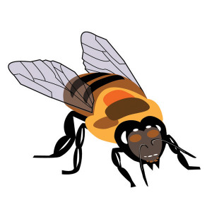
Nothing of course would be possible in the gardens without our pollinators, all of our pollinators, but the honeybees especially have been a fabulous addition to the farm, and honestly, now, I can’t imagine not keeping bees. It’s something I hope to keep doing long into my dodderage, both for the simple fascination with these industrious insects, and of course, for the delightful honey they produce. This lovely worker bee was illustrated for us based directly on one of our photographs that we’d taken during a hive inspection last year.
Then of course, there are the goats. Don’t laugh, but I actually resisted getting goats, for years, much to Mr. CV’s dismay. Eventually he convinced me, and yes, now that we have goats I am kicking myself that we didn’t do it sooner. I said before that we want the extra room for a larger orchard, but that’s only a half-truth…well, maybe a quarter-truth. If I’m being completely honest, we really want the extra acreage for more dairy goats. There, I admitted it.
Central to the logo though is ‘Farm Woman’ herself. We wrestled with this just a little at first, as Curbstone Valley would not be possible without either one of us. On this farm there’s no question that there’s an amazing farm man behind this ‘Farm Woman’, who helps to make everything possible here on a day-to-day basis. I couldn’t do it without him, any more than he could do this without me. However, at the risk of morphing the logo into something resembling ‘American Gothic‘, for simplicity sake, we decided that it was just fine to allow this red-headed Farm Woman to take center stage.
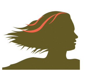
As we were both born natural red-heads, the glint of red hair helps to make this logo that much more personal
So, from today forward, we’re thrilled to say that Curbstone Valley Farm no longer has a crisis of identity. Our new Farm logo is something we feel finally represents us, as well as what we’re doing here, and hope to still be doing for many more years to come.
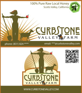
Now that our online identity has been transformed, we can finally to start apply our new logo to other things. Perhaps some snappy new business cards…
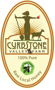
…and this year we’re looking forward to finally being able to label our honey jars too!
I’m sure we’ll find a myriad of other uses over the coming months as well. In the meantime we’d like to extend a very special thank you to Susan, at Stirling Design, for our fabulous new farm logo!





Oh that logo looks so well Clare – it reminds me of the 1940’s WWII Digging for Victory themed posters.
I hadn’t really thought of that, but you’re right, Rosie. It does have that quality about it. It’s also an era I love. I used to joke that I was born a few decades too late 😉
Clare this is so wonderful…I adore the logo and the whole website…hats off to your new identity!
Thank you, Donna!
I think it is fabulous and very much represents the farm and your passions! When I first saw the logo I thought it was great to see some red hair on the farm woman. And then when I read why it was a nice surprise as I am a redhead too!
Miraculously, considering the general reputation of redheads, Mr. CV and I have managed to survive each other over the years. I actually do fit the ‘fiery’ redhead reputation, although he’s much more level-headed 😉 I didn’t realize you were a redhead too!
That is an awesome logo! I love it! Great conceptually, and very beautifully illustrated. I’m sure it will serve you well.
Thank you, Zoe, that means a lot knowing that you have a wonderfully artistic eye!
I love the new identity! I can appreciate the difficulties of creating a new image, and a new branding. You and your designer did a great job! I tried the same thing at HA a few months back. Fortunately I married a graphic designer and someone with much more artistic abilities than I have, and she helped me. My logo is still missing the bee though. As soon as I work that one out, I will add it.
As soon as I saw your gravatar I thought “Goat Goddess”, but I guess Farm Woman is a tad more modest! 😉
Designing for a small space like a honey jar is more challenging than it might seem too. You’ll have to share your final design with us when it’s finalized.
Yes, the honey label was giving me fits last night. I think the labels for the hex jars will be easier. I will post what we finally come up with though. I’ll probably move the Bee Friendly Farming logo to the nutrition panel on the back label, as I don’t really like that bright green. Up to now we haven’t been selling much in 1 lb jars, but the way our bees are building up already, I’m optimistic for a good honey harvest this spring, so figure I should be prepared! 😉
Wonderful! I like the vision/energy feel of the arms extended, and the foursquare stance. Also I’m fond of just a touch of red in anything. You go, Farm Woman!
I like her strong stance too, and I think those that know me well would stay that reflects my personality quite well 😉
Congratulations Claire! Beautiful logo and I did wonder about the bit of red in the hair. Two redheads . . . I always used to dream about being a redhead ;>)). Your farm is so special and I am so happy for you for following your dream to farm full-time. It is a great time for food in our country and others. Young farmers are reclaiming our food from the giant commercial industry and it is so fabulous! All the very best wishes to you!
Well, at the moment, full time is still a dream, but I’m at least getting closer to that. I’m encouraged that there are so many others like us that are supporting their local food movements. Food production in America, on the scale that is now, just doesn’t seem truly sustainable in the long term. I’m all for reclaiming whatever we can!
Love it, and a good look into what a thoughtful logo design process should be. Nicely done!
Thanks, Alan. It really was a process, and for me a learning process. All of the elements within the logo have to work together, and not out-compete each other, and although the final design seems straightforward enough, it took a lot of thought and effort to achieve the end result!
Great job on the logo! I really like the color choices, it gives it a very earthy feel.
I love the colors too, they are very much colors that I typically gravitate toward. Greens, golds, browns…all colors that look great on redheads 😛
Fabulous logo! Love the farm woman – with the red hair! The goats, bee, and apple all add to the sense of place, too. Very well done.
Thanks, Holley! I just hope the chickens don’t feel too left out 😉
Farm woman rocks! I’m looking forward to another year of farming vicariously through you.
Ha! Well, I better be a little better blogging then 😉 I’ve been falling behind on the blog lately, in a determined attempt to keep the garden on schedule this year!
What a nice strong graphic! When picking a name for our farm, most of the names I came up with sounded so much like subdivision names (subdivisions: where we name the streets after all the trees we cut down for construction). Having been through the label designing process once, and in the middle of a feels-like-it-is-never-going-to-be-complete rebranding process, I can appreciate all the work and considerations that go into something that ends up looking relatively simple. The doe in the graphic gets extra compliments for being such a fine example of what a dairy doe should look like. Congratulations on such a wonderful result!
Coming up with the name was difficult. It’s challenging to come up with something that doesn’t sound trite, and then add in the need to acquire a domain name, and it definitely ups the ante!
I’m glad you like doe. Of course she’s a fine example of a dairy doe. She’s very heavily based on some of the photographs I took of YOUR doe, Helen of Troy, at Watsonville last year 😛 I would have used my own doe as a model, but she wasn’t in milk! Poor Susan, I kept harping on the importance of the doe’s ‘dairy character’ when we were discussing the logo…but I think it turned out great!
Absolutely LOVE it. 🙂
Thanks, Esther! Oh, I see you revived your blog!? I’m going to have to stop by and catch up! 🙂
It is so professional and I LOVE IT!! Noticed it straight away. So much thought went into it and you must be very proud! WELL DONE! 🙂
Thanks, Barbie! 🙂
As a graphic designer in my previous career, I can vouch for the comprehensive branding of your new logo. It pulls in much of what the farm is known and shows the energy that is evident in all that you do on the farm. Just having the logo will help give you new found direction and purpose as hokey as that sounds. It opens up new ideas too. I read your other post on thinking of moving and all the obstacles in your way for getting a new place to farm. It was a funny post, despite your frustration with the hunt and banks.
Thanks, Donna. You’re right, the new logo is already making a few extra gears turn 😉
I had to try to keep that last post on the lighter side. I know that some day we’ll look back and laugh. I also know that, eventually, our patience will be rewarded!
I love your new logo! When I saw it, I immediately thought that it well portrayed the energy and scope of your farm. Susan did a fabulous job. If I saw a jar of honey with your new logo on it, I would buy it! Any plans for internet sales in the future?
That’s an interesting question, Deborah. I’m not sure if selling honey online would be feasible at the moment, as the shipping costs per jar may make the price quite prohibitive, but it is something I’ll look into. I just hadn’t considered it!
Your friend did an absolutely fantastic job with the logo. Beautiful artwork, simple but as you say it conveys a lot. Takes a lot of talent to come up with something like that and she did it perfectly. I wondered about the red streaks in the hair, glad you explained – had no idea you were a redhead!
There’s no question, that left to our own devices, we never could have come with it on our own. The red hair just makes it that much more special 😉
Clare, I had noticed your new logo on the comments you left on my blog, and I love it. I actually can’t figure out how you do what you do and have any time for day jobs(!), so I can see why you are moving in a direction to make the farm your livelihood. Thanks for taking us through the process of designing the new logo; I love how each element has personal meaning (as well as the whole thing being beautiful).
I think one of the most challenging things for us has been choosing what to focus our emphasis on. I have a tendency to want to have my fingers in many pies at once, which is fine, but streamlining our focus will help us to become more efficient. The process of logo design forced us to sit down and consider where our attention is most likely to be focused as we move forward, so it was a very valuable exercise, with a beautiful end result!
As an ex-Madison Avenue guy, I have to say it communicates an elegantly simple and down to earth business. I love the personalization(woman and red hair), and the shovel communicates an artisanal or non-corporate feel.
I love the different iterations. Congrats!
Thanks, Reed. That’s exactly the feel we were after. Something much much more personal, individual, and less conglomerate-like. 🙂
Beautiful and meaningful! Lovely, simple farm identity and it works.
Thank you, Shirley 🙂
Clare, It’s beautiful. You know my favorite part but I sure hope it’s a generic goat and favoritism wasn’t involved. Carolyn’s Shade Gardens doesn’t have a logo, maybe it needs one. I did just get new business cards made though, and I love them. Instead of the traditional card which generally gets tossed, I opted for a bookmark with photos of all the plants I specialize in plus the garden. There’s where you could include all your areas of interest. I would be happy to mail you one if you email me. Carolyn
I like the bookmark idea, I think that’s very smart. I occasionally use business cards as bookmarks, but more often than not they get round-filed. Something beautiful, and functional, I expect is much less likely to be composted! 😉 It’s a very interesting idea, I’ll drop you an email, I’d love to see one!
Oh Clare, I’m so happy for you! I’ve told you before you live the life I’d love to live. Sometimes I feel I was born to be a farmers wife. I married an engineer and the nearest I’ve ever been to farming is gardening my half acre and visiting farms. Oh but life is very good and I wouldn’t change a thing, but I do love reading your posts! Best of wishes for your new start… and put me on your list to buy your honey should you ever decide to sell online. Looking forward to reading more of your adventures!
I married an engineer too…and sometimes his engineering skills are very useful around here! 😛 I’m definitely going to have to look into the practicality of online honey sales 😉
I’ve grown attached to your new logo, as I plough thru the backlog on Blotanical and my G Reader. A picture is worth a 1000 words, and you bring us the words that give the picture meaning. Plus I can lose myself in the story as I look at the logo …
Thank you, Diana. We’ve grown attached to it too! 🙂
I quite relate. We have a hobby farm which is also becoming more of a work farm. I grow daylilies for market and my husband breeds honey bees. Like yourself, we find our happiest hours are tending the pastures and hope to be able to have more time to do so.